“Even though it’s extremely capitalist and you’re contributing to a lot of problems and helping corporations sell things, it gets weird imagery to the masses in a way that galleries and more niche circles do not”


“Even though it’s extremely capitalist and you’re contributing to a lot of problems and helping corporations sell things, it gets weird imagery to the masses in a way that galleries and more niche circles do not”
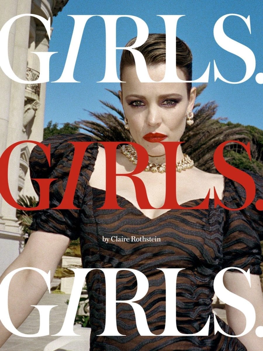
The luxury fashion photographer and founding editor of Girls. Girls. Girls. Magazine considers how her signature aesthetic of sex and glamour fits into the wider conversation around women’s representation
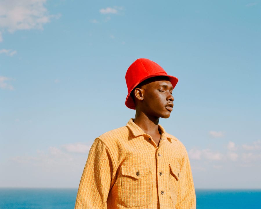
As we approach one year since Covid-19 was declared a global pandemic, four commercial photographers reflect on the lessons they’ve learned, and how to continue growing professionally when work is sparse
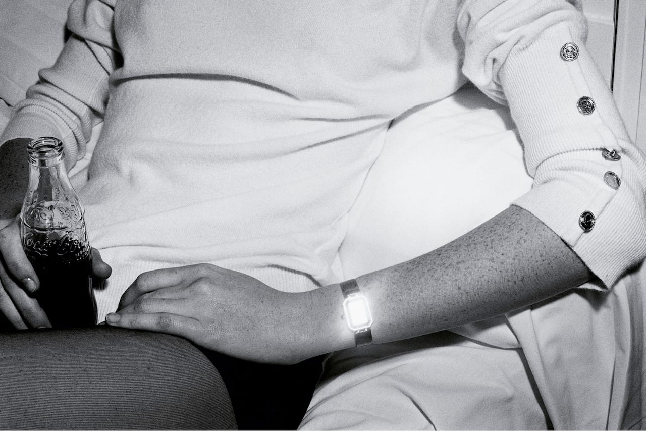
Think of Guy Bourdin, and you’ll probably think of intense, transgressive images shot in highly-saturated colours. There’s his photograph for Pentax in 1980, for example, which shows a gush of red liquid apparently streaming from a prone woman’s mouth; or his shot from 1978, which shows a woman’s bottom and legs lying on orange sofa – her head firmly out of the picture.
But Bourdin also shot award-wining black-and-white work, which is less known now but which was celebrated in its time. There’s his black-and-white campaign for Chanel’s first ‘Premiere’ watch, for example, which he shot in 1987. Influenced by his interest in Surrealism – in particular Man Ray – and not clearly advertising images, this campaign went on to win the Infinity Award at the International Center for Photography (ICP) in New York in 1988.
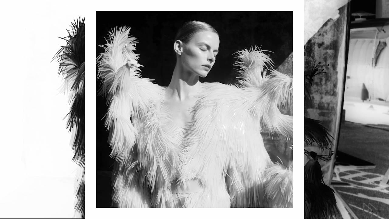
Fashion photographer Sølve Sundsbø was awarded an Emmy in 2011 for his direction of a series of short films, shot for the website of the The New York Times Magazine. The series, 14 Actors Acting commissioned by Kathy Ryan, was acclaimed as a “new approach”, but the Norwegian photographer claims he simply “dabbles” in film.
“I’m not proficient or even adequate yet,” he says. “But film is a way of rejuvenating the work I’ve already done. It’s like a little vitamin boost.”
Sundsbø’s photography career has been meteoric. Four months into a course at the London College of Printing, he attracted the attention of Nick Knight, and became his assistant for the next four years. Now he’s a regular in Italian Vogue, Visionaire and W magazine. His commercial clients include Chanel, Hermès, Nike and Yves Saint Laurent and, outside the fashion world, Royksopp, Friendly Fires and Coldplay have all chosen his work for their album covers.
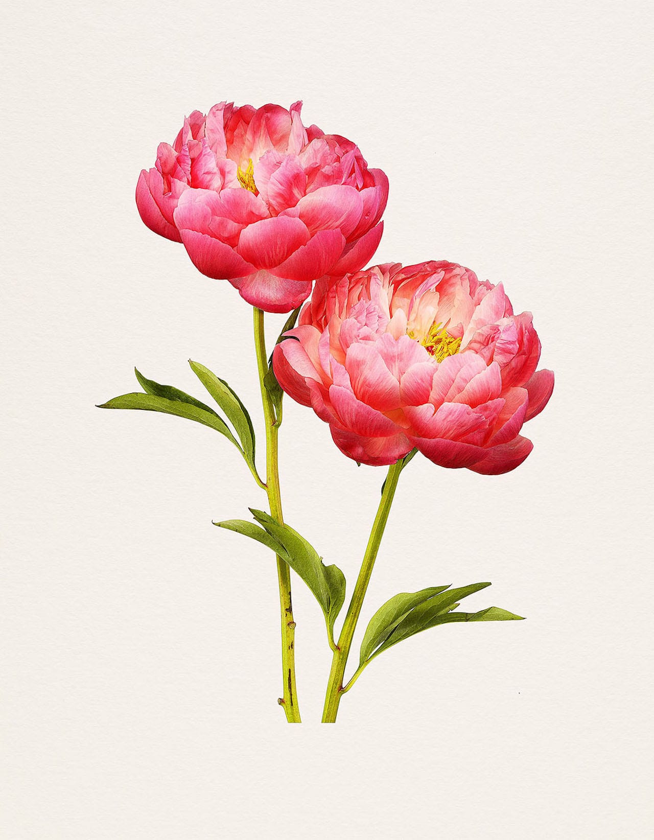
“I am just obsessed by the beauty of botanical drawings,” says Kenji Toma, describing his new book, The Most Beautiful Flowers. It’s a homage to Pierre-Joseph Redouté’s celebrated book of watercolours, Choix des plus belles fleurs [The most beautiful flowers], which was first published in France back in 1827 – long before colour photography was available. “His images were illustrated with the purpose of replicating the botanic subject as close to reality as possible,” says Toma. “I’m more interested in doing the exact opposite with photography.” His series shows hyperreal, unrealistically perfect images of flowers, each shot with the same lens, angle, and lighting, and delicately arranged with pins and armature wire. Going one step further than nature, they put a contemporary spin on the concept of the botanical encyclopaedia.